Could you introduce yourself?
My name is Giovanni Nakpil. I am 23 years old, and currently living in Toronto, Canada.
How did you get started at 3d?
Actually, I almost never got to do 3D at all. I originally saw myself taking Creative Advertising in College, since I thought that was the field where I could best apply my love for drawing. Back then, 3D animation was not quite as big as it is today. After going through different courses the college offered, I came across a 3D animation course. It ended up becoming a draw between that or Creative Advertising, but I eventually chose the former rather than the latter. To this very day, I still thank my lucky stars that I chose what I chose because I have heard from a few friends in advertising that it is in a slump right now.
What are your main sources of inspiration?
I watch a lot of movies and read a lot of books, so the bulk of my ideas are sparked either by something I read, or something that I saw on the screen. Also, everyday surroundings can be a great source of inspiration for me. If I see something outdoors that piques my interest, I tend to translate it either on paper or through the computer.
What's your favorite genre, theme?
I would have to say science fiction. I grew up with the Star Wars series, so the majority of my work will always reflect on my love for spaceships and weird aliens. Sci-fi is a genre that really gives an artist a chance to let his/her imagination run amok. That is why I love it so much. I also like to do imagery that deals with modern life and issues. I've always wanted to duplicate the many compositions of some of the grittier photographs that can be found in LIFE magazine, or National Geographic. My first attempt in this would be the RUSH HOUR image.
What are your strong points?
Modelling and animation would be my strong points. Modelling, for me, is the ultimate kick when doing 3D. I get the most of my satisfaction through that part of the process. Animation, even though I havent done it in a while, is something that I really devote my time to in order to make sure everything looks right.
Tell us a little about "Rust".
"Rust" is supposed to be a title for this series I had in mind. My original plan was to create little 2 minute animated shorts that took place inside this Rust world. Its your typical post-apocalyptic world where all its inhabitants wear worn leather and look weird...very Mad Max-ish. The main character (the one in the picture) is a loner type who travels the land on his hoverbike. He's basically your archetypal hero who wanders around and gets himself in trouble. I wanted to give the model a very weary appearance. He should at least have the look of someone who has been travelling thousands of miles while fighting evil.
How much time did you spend on it?
I worked on him whenever I came across a break from the job that I was doing at the time. I devoted at least 2-3 hours everyday for one month modelling and texturing him.
What kind of reference material did you use?
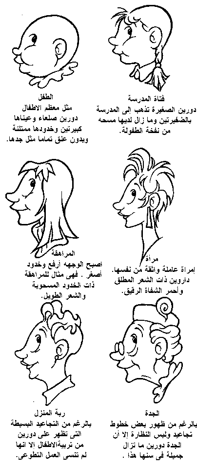
I created the Rust character after a year of not modelling anything remotely human in 3D Studio MAX. Because of that, I wanted to make sure that I had enough reference material so that the model would progress fairly well. I ended up buying a lot of books by Burne Hogarth. The one that I really used was "Burne Hogarth's Drawing the Human Head" since the references inside had more of a comic-bookish quality to them. It offers a very extensive look at the head as a structure. I love how the author reduces the head into simple geometric blocks to show the readers just how exactly it would look when each section of the face is broken down. For other references, I also checked out many drawings by Frank Frazetta and Simon Bisley for muscular and defined faces.
How did you model the face?
For the face of this particular character, I decided to use the very popular method of Surface Tools modelling. I started off by drawing the face on paper. I did several drawings, each of them with varying degrees of detail. After I decided on a particular look, I then drew highly detailed views of the front and side of the head for reference. From there, I saved out the two drawings as bitmaps so I can place them inside 3D studio Max as a visible texture. Once each textures were placed on their respective viewports (front and side), I then proceeded to draw the main countours of the face via splines. Its basically like tracing the drawing and connecting the dots. After each spline is placed accordingly, and while making sure all spline corners were set as CORNERED for easier manipulation, the next step was to pull out the structure in 3D space. From there, it was just a matter of tweaking, and converting certain areas of the spline into bezier to give the model a smoother, organic look.
Once you have all the vertex of your spline cage placed, do you transform directly corner vertex to bezier vetex or do you also use smooth vertex in order to save time adjusting all the bezier control points?
Once I have all the vertices connected, I make sure everything is set to CORNER. This is because it is a lot easier for me to pull it out into 3D space. Having the corner vertices as smooth, or bezier can be a pain when pulling out because of the way they sometimes interact with each other. Set to cornered verts makes for easier and faster manipulation. It is only when I have all the vertices placed in 3D space that I turn the corners into SMOOTH. From there, I tweak the individual points, turning some into bezier, to get the features of the character out.
Do you have your spline cage on paper, or do you imagine it as you move on?
I just create the spline cage on the program itself rather than on paper. I think it has something to do with the fact that I'm pretty anal about the separation between where the traditional aspect of the process ends, and where one begins. I get a better feel of where to place the splines when the reference drawing is staring at me up in my monitor, instead than on paper. Although it shouldnt matter at all if you do it on paper or in the program itself.
How did you model the other parts of the body?
I would say at least 80% of the character are composed of splines. The rest, like the utility belt, the strap, and other parts of the gear, are composed of lofted geometries. For the straps and belts to conform, I just took the lofted objects, and added a path modifier with a spline guide that followed the contour of the character's body. From there, it was just a matter of using the free form modifier to move sections of the belt so it would look like it fit snug on him.
How did you texture him?
Since the style of the character is somewhat stylized, and comic book-ish, I avoided using photographs for textures. For the face, I used a tile-able skin map. I first unwrapped the mesh in MAX, and brought the wireframe guide into Photoshop where I placed the skin map on him. From there, I used tools such as dodge and burn to give the skin some variation. After everything was pretty much finished, I then created a black and white image of the texture to be used for bump mapping and specular mapping. For his suit, I used a mixture of procedural noises and texturemaps to give it a very layered look.
How big do you usually paint your textures?
I dont usually create my textures below 1000x1000. Very large texturemaps lend to the image and gives it a very crisp and rich appearance. Of course, computer resources tend to suffer, but for the final output, its definitely worth making your maps HUGE!
What are the maps to pay attention to in order to have a realistic looking skin?
From my experience, the most important part of making a texture look realistic is through a good mixture of specular mapping and bump mapping. Also, the bump map should not be overly high setting-wise. Sometimes people make the mistake of putting in a high number for their bump map, making the image look somewhat irregular. Subtlety goes a very long way when making skin maps look realstic.
Which coordinate system do you think is best to use, when dealing with characters?
When mapping characters, I like to use cylindrical coordinates. It makes creating the texture in Photoshop that much more easier because once you unwrap the mesh with the cylindrical coordinates, the wireframe image is neatly laid out for you to paint on. This pretty much depends on the form of the character though. If, say, I was going to map a fish, I would use a planar map instead. I would then create the texture by using the profile render of the fish as reference in Photoshop. If a little bit of stretching happens in the middle area of the mesh, I just apply a mask with a top texture to blend it together seamlessly.
What do you think of 3D Studio MAX texturing features?
I havent really explored the material editor to its fullest extent, but from what I have used, I think that it is one hell of a powerful tool. Its filled to the brim with options...from unlimited material channels, to its awesome procedurals, its pretty safe to say that its probably one of the most powerful editor of its kind in the industry.
Tell us a little about "Logan".
I created the Logan image for a contest that was held at 3dluvr.com. The contest called for me to make a 3D composition with a comicbook superhero as its subject matter. I chose the Logan character because I have been a big fan of the X-men ever since I was in elementary school. For the contest though, I did not want to create your typical spandex clad superhero. To increase my chances of winning, I decided to create the character in a realistic manner thru the use of real world clothing. Since I could not really afford any of the cloth plugins for 3D Studio MAX 3, I decided to model the clothes via vertex pushing and Meshmooth (NURMS). Needless to say, I encountered a lot of problems and headaches, but I am very happy with the results. From a composition standpoint, I wanted to create a scene that was dramatic, yet simple. The juxtaposed images of the Logan character ready for attack, and the peaceful, almost serene background, turned out to be an interesting contrast.
What technique did you use to model the face?
I used a combination of Surface tools and Polygon modelling. This technique, I find, gives users a lot of control when adding detail to the model. I created the base structure of the face through the use of splines, then turned it into an editable mesh for further editing. Once an editable mesh, you can cut, chamfer, extrude faces to your hearts content. Those features were heavily used when adding details such as folds on the skin, or a defined area such as the jawline. After the detail work was done, I added NURMS on top of the stack to smoothen things out.
Have you ever tried NURBS for characters?
No, I have never tried that method of modelling.
Could you compare Polygon Modelling and Patch modelling?
Polygon Modelling is great for getting a mixture of organic, and hard edged look. You have a lot of control in terms of what to do with the mesh. You are not limited to having tri or quad corners when you are using it (although it might be a good practice to keep your meshes as quad, so that it will look clean). Editing with polygon modelling is, for me, one of its highlights. You can do numerous methods of adding detail. Methods such as chamfering edges to make it look hard edged, extruding faces to add different branches to the existing core mesh, cutting and splitting areas for designated detail, adding weights to the vertices, and the list goes on. The only drawback is, if you get carried away with the detail work, your polygon number can get really high once you subdivide the mesh cage. When that happens though, you can always modify/animate through the mesh cage, and just have it set up so that during render time, it would render out the Subdivided version. As for patch modelling, to be honest, now that I have tried out polygon modelling, I dont think I will ever go back to it. All the pros that I can think of is outweighed by everything that polygon modelling can offer. I just use this method for when I construct the rough mesh cage through splines.
How did you texture it?
The method of texturing used was pretty much similar to that of the RUST character. I used cylindrical mapping as the dominant coordinate type.
How did you model the clothes?
For the clothes, I applied the same method I used while modelling the face. I created the mesh cage through splines. After I created the basic structure, I then collapsed the splines (with a SURFACE modifier set to zero steps) into an editable mesh where I could then use the cut tool to create patterns on designated areas. These patterns formed the subtle indentations and creases of the fabric. It was just a matter of pushing and pulling the vertices to give the mesh the needed detail in order to convey the folds and such.
How did you model the razor wire?
The barbed wire was fairly simple to model. They were actually just individual circles (with sharp geometries spread out along its surface) rather than a one continuous helix-like mesh.
How did you create the hair?
The hair was a mixture of texturemaps, and actual modelled hair. Since Logan's hairdo is somewhat out of the norm, I did not want to worry about having to re-create it as a separate geometry, rather, I decided to incorporate the shape into the form of the head mesh. This made things a lot easier for me during the mapping stage. All I had to do was paint both the hair texture and skin texture into one map. To add some extra dimension and mass to his hair, I lofted several clump like patterns, and stuck it on his head.
For characters, do you prepare your models for animation in the modelling process?
Yes. I always make sure that all the joints deform properly once the appendeges are bent. You want to make it look like there is an actual bone underneath the skin and clothing.
How did you achieve such realistic looking snow?
Through the use of noise procedurals. Just playing around with the procedural tools in MAX can really get you the results that you want. For the displaced geometry underneath Logan's legs, I used just that -displacement mapping. I tweaked the areas by pushing and pulling vertices so that it would conform properly to the character's pose.
What kind of lightning did you use in this scene?
I believe I have four different lights on the scene: One fill, two spotlights that are directed at him from the back and front, and one coming from beneath the model.
Did you in anyway simulate the reflective light from the snow?
The light reflected from the snow was actually simulated through a spotlight placed under the character.
Tell us a little about "Rush Hour".
Rush Hour was my very first full composition in 3D. I created it back when I was still attending school and learning 3D MAX. Being my first true personal project, I took the extra step of taking pictures of subway interiors at the subway station near my house. The decision for the scene to take place inside a subway is integral in showing the overall theme of the piece, which is loneliness. I tried to inject many symbolism and imagery in the composition through the use of the windows, and several others elements in the scene. I can remeber adding the tiniest details that no one will ever pick up on. I dont know if its as noticeable in this particular resolution, but I actually modelled a gum that was spit out on the floor. Unfortunately, I lost all the max files and texture files that I created for this scene. Luckily I was able to salvage the image found in this article.
How did you model the character?
I modelled him through the use of patches. This was back when I did not know Surface Tools even existed, so I was pretty much pulling out my hair out frustration at one point.
The clothes as well as the face have a very particular look (crumpled). How did you achieve that?
It was done through a mixture of textures and manipulation of the points on the patch grid which made up the clothing.
When creating your textures, do you rather start from real world photos, other textures or from scratch?
Depending on the kind of style I am doing I guess. I think that in order to get a fairly realistic looking texture, you really need photographs as reference...basically a base to start off your texture on. I usually take a photograph, and then just modify it in photoshop so that it looks fairly flat, and without any shininess reflected from a particular light source. I leave all the specular and bump effects work to MAX's material editor.
Could you explain the lightning used in this scene?
If I remeber correctly, I think I placed a row composed of several omni lights in the middle to illuminate the environment. For the character, I placed three spotlights that focused on him. One was directly in front, and the others on the side and top. Almost all the lights were colored to give it a painted look.
Tell use a little about "Scout" and "Surveillance Ship".
These were renders taken from a game that I was contracted for. Luckily my employer gave me permission to use them for my website.
What inspired you to find such original shapes for these ships?
I based the design on ancient jewelries. Basically, I wanted these ships to have a very Egyptian-like look to them. I also wanted them to have a very elegant feel...like something that a highly sophisticated race of aliens would create.
As someone wrote in a critique about these ships, they look organic: grown, not built. How did you achieve that?
For the design of these ships, I wanted to use very irregular and organic shapes. I guess through the mixture of organic and streamlined shapes, I was able to achieve a certain look that departs from your typical X-wing or TIE fighter design.
Are you fed up of traditionnal 3d space ships everyone has seen thousands times?
I would not really say fed up. It has just reached a point where it does not interest me much anymore when I see the typical Star Wars scene with the typically huge lens flare in the background. Mind you, there is absolutely nothing wrong with creating scenes like that. Its just some artists might benefit from creating ships off their own designs rather than doing Star Wars stuff. I love spaceships that have a particular design where you do not know what is up from down, or front to back. Something that has more of an abstract design, for me, is so much more interesting to look at.
Do you make the whole scenes in 3d or do you composite them?
I usually make all my scenes in 3D. For stills, I should really think about compositing them just so I can have more control over each layer.
Do you retouch or edit your renderings afterwards?
Yes I do. There are always flaws that I want to fix after I hit the render button. Photoshop is great for that.
Do you have everything clear in your mind, lights, textures, color, etc when you start an image or it develops as you move on?
I have a pretty vague idea as to how the final image would look during the rendering stage. What I do lock down on is the composition and the theme. From there, it is just a matter of fleshing it out through sketching and the actual creation in 3D. There are a lot of hit and misses along the way.
What are the most important points in a scene to make it look good?
In my personal opinion, it all has to come down to subtlety. Not overdoing something in a 3D scene is definitely important. When putting a lense flare for example, do not place one on your scene just for the sake of having it there. Have it there only if its truly essential to the image. I once saw a space scene that had at least five different lense flares going off on different angles (which is fairly impossible in the real world). Also, some make the mistake of bombarding their images with lights, just to make sure that every detail on the scene is accounted for. Looking at compositions by some of the artists at the 3D Artists gallery, you'll find that what makes their compositions so successful is that they are not afraid to hide parts of their images in the shadows. Having a dramatic play between light and shadow is definitely something that can help elevate an image. You do not have to show off every single detail on the mesh you worked so hard on (although I know how tempting it is to do so).
How important are sketches, drawings, ... to your artworks?
For me, they are just as important as the 3D creation process itself. I always make it a point to sketch out the elements that I will be doing in 3D just so I can familarize myself with whatever it is I will be doing. Plus, it gives me a visual reference, which is a lot better than trying to see it inside my head.
What is the most improtant aspect of 3d graphics, and why did you chose this medium to express yourself?
For me, the most important thing about 3D graphics as a medium is the ability it gives me to express myself through the images that I create. Invoking some form of response from the viewers (may it be negative or positive) is something that I really like. It is the same with all the different mediums of art...the difference is very minimal. What sets 3D apart for me though is that it gives me the ability to create the image, and then have it conform easily to whatever I want it to do. The varying styles you can create are limitless. With 3D, I can create something that has a photorealistic look, and then without hesitation, have that transform into something very stylized through the use of different rendering filters, or any other techiniques one might have up his/her sleeves. The ability to control something like that with such ease is, for me, what gives 3D an edge over the other mediums. It makes creating something a very exciting process.
Some people believe that in order to be a good 3D artist, you don't have to have traditional art skills... what are you thoughts on this?
I really believe that having good traditional skills in art is very important when doing 3D. Being traditionally trained means you have proper knowledge of perspective, anatomy, good composition, and, are quite adept with whatever art tools used. Those are the very same elements that are needed in order to produce a cool 3D image. Now in contrast to someone who does not apply any of the stuff mentioned, more likely than not, his or her image will always end up missing something in terms of vision, and the wow factor.
What is the best way of getting started in 3D imaging?
Learn your stuff. Spend hours with whatever software you intend on using in the industry, and just explore it inside out. You can do this either by taking a course in school, or by buying the software and locking yourself inside your room with a good supply of food and water for several months (kinda joking hehe). Also, I believe that everything happens for a purpose. So whatever first job in the industry that might land on your lap, take it. From there, its just a matter of meeting and knowing people in the industry. Having a wide number of connections to fall back on is invaluable. Keep in touch with the people you meet, because they are the very ones who will be passing along contract work your way, or vice versa. One of the main reasons as to why I'm working now is because of the people who I've met along the way who have helped get me this far. Keeping yourself grounded is also very important. No matter how good you are in 3D back in school, or how much of a hotshot you were then, do not let it get to your head cause most likely companies will not hire you anyway if you've got a pretty negative, and stuck-up attitude.
Are there any artists at 3D Artists you particularly admire?
Yes. There are a lot of artists on your site that continually put me in a state of awe. One of them would have to be Jeremy A. Engleman for the way he treats 3D like a canvas to paint beautiful images on, Eni Oken for the way she uses digital light to illuminate her scenes in such a surreal (yet very realistic) way, Timur Baysal for his awe inspiring modelling skills and texturing ability, and Victoria Brace for the fantastic imagery that she creates.
What will be your future plans?
Besisdes hitting it big and eventually buying out ILM and Pixar, I plan to focus more on developing my style and experimenting with the medium as I try out new and different things with it. I also want to expand my knowledge and learn other fantastic software packages such as Maya, Lightwave, and Softimage. To sum it up, I plan to continue learning what I need to learn in the coming years so I wont get left behind. Its survival of the fittest out there, and I plan to keep fit.
Thanks.
-----------------------------------
other cool articles about 2d , i found it very useful for beginners and professionals at :
http://www.animationarena.com/2d-animation-articles.html


